🫶 Understanding the User
The Challenge
Ruba faced a critical challenge: empowering parents and individuals to navigate the complex world of education financing while providing a seamless user experience. Users were grappling with repetitive data entry, limited payment options, and difficulty finding the right institution.
The Discovery
To address these challenges, we embarked on a deep dive into the user's world. Through usability audits, we uncovered pain points in the existing design. Market research shed light on competitive offerings, and surveys provided invaluable insights into user needs and preferences. By creating detailed user personas, we gained a profound understanding of our target audience.
Usability Audit
We began with a thorough usability audit of Ruba's existing designs. This process involved identifying pain points and areas for improvement to create a more intuitive and user-friendly experience. The audit provided valuable insights that guided our subsequent design decisions and helped us prioritize key features.
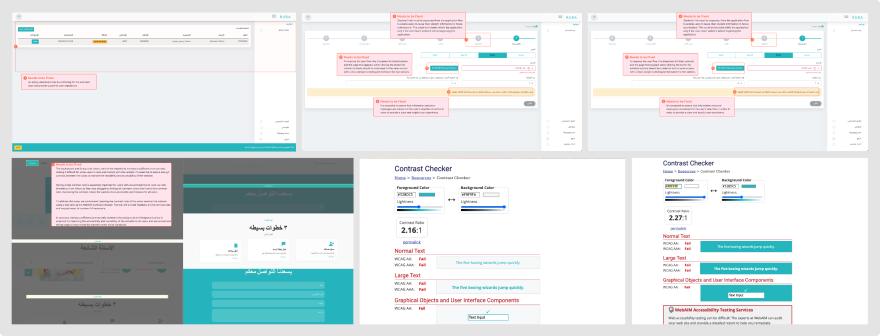 Sample Usability Audit Image: Highlighting Key Pain Points and Areas for Improvement in Ruba's Existing
Designs to Enhance User Experience.
Pain Points Sample
Repetitive Data Entry
Parents, especially those with multiple children, found themselves submitting the same information over and over.
Insufficient Contrast Ratio
The background and foreground colors lacked sufficient contrast, making text hard to read and reducing readability and accessibility.
Lack of Payment Integration
Ruba did not offer integrated payment options or reminders, limiting the user experience by not providing a complete end-to-end solution.
Recommendations
Central Profile System
Implement a centralized profile to store and manage user information, reducing repetitive data entry.
Introduce Payments with Reminders
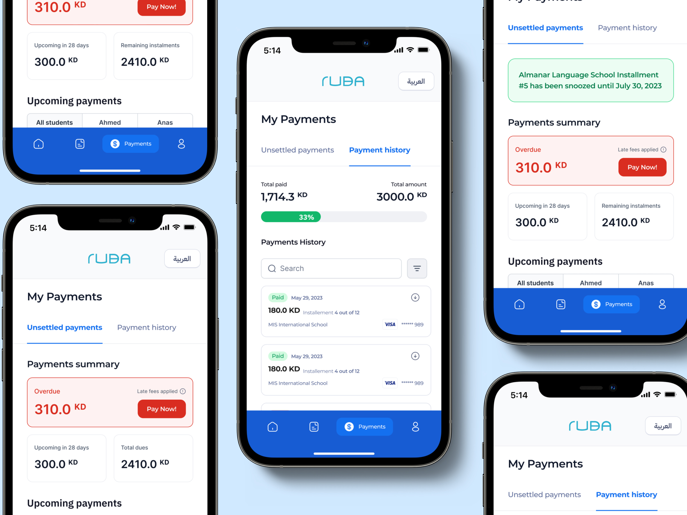
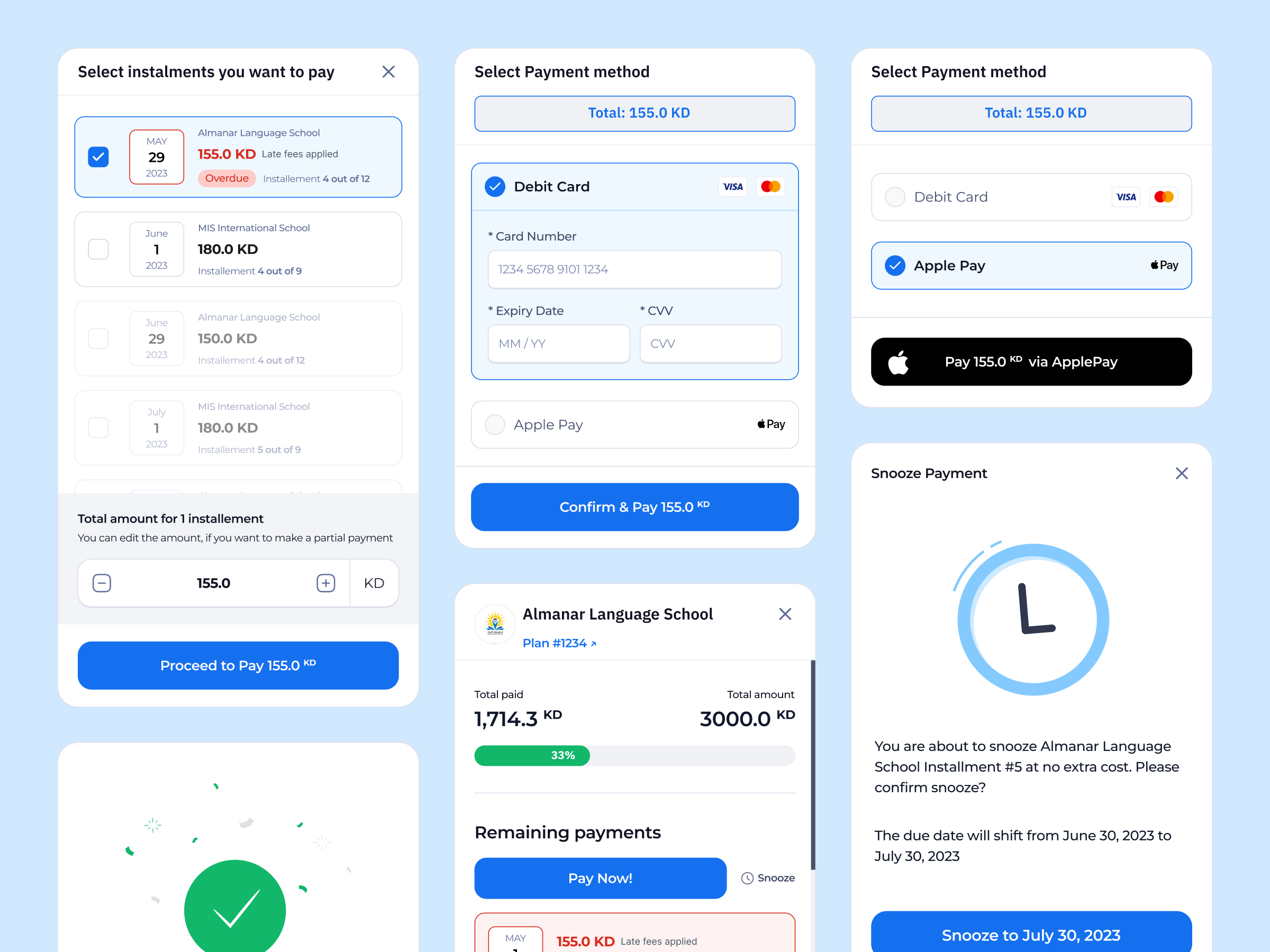
Implement a payment system with reminders, transforming Ruba into an end-to-end solution for searching for institutions, applying for financing, managing payments, and more.
Market Research
We conducted extensive market research to understand the landscape and identify what competitors were doing well and where they fell short. For more details, you can refer to my Medium article on conducting a comprehensive competitive audit. A feature comparison table was created to benchmark Ruba against competitors. This exercise highlighted gaps in our current offerings and helped prioritize features that would provide the most value to users.
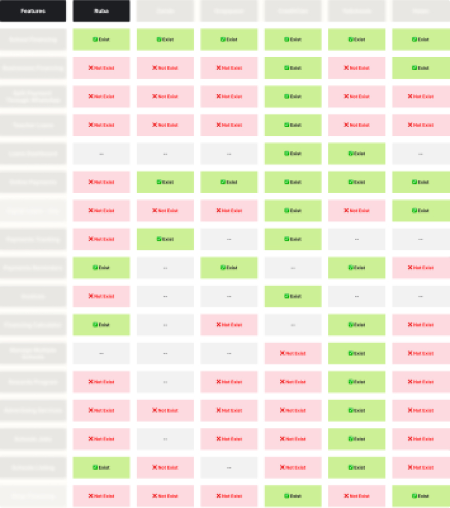 Benchmarking Ruba: A feature comparison table highlights gaps and opportunities against
competitors.
Feature Prioritizationh
To ensure we focused on the most impactful improvements, we used a detailed feature prioritization process. This involved scoring each feature based on Desirability, Feasibility, and Viability. For a deeper understanding of this method, you can refer to my Medium article on the Kano Model.
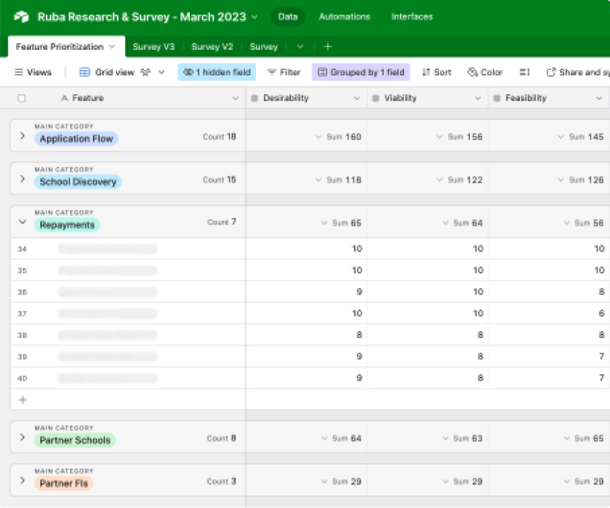 Prioritizing with Precision: Airtable base showing feature scores calculated based on Desirability,
Feasibility, and Viability.
Surveys
To truly hear directly from our users, we conducted surveys in both English and Arabic. These surveys explored their needs, preferences, frustrations, and reasons for seeking financing. The insights we gathered were pivotal in shaping Ruba’s product strategy, ensuring that our solutions were aligned with what users really needed. If you’d like to see the questions that guided our strategic decisions, you can view the surveys directly through the links provided below.
Personas Definition
Building on the rich insights from our surveys, we created detailed personas—fictional characters that represent key user groups. While these personas are not real individuals, they are grounded in the data we collected, making them powerful tools for guiding our decisions. Whenever we design a feature or make a strategic choice, we ask, "Will this make our personas' lives easier?" and "Does this solve their biggest pain points?" By keeping these personas at the center of our strategy, we’re crafting an educational financing experience that truly meets users' real needs.
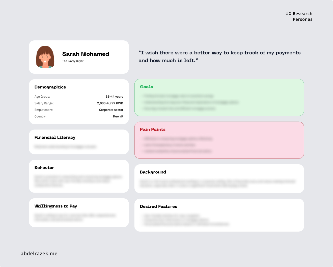 Visualizing Our Users: Fictional personas based on real data guide our design decisions, ensuring every
feature meets users' true needs.
📱 Design
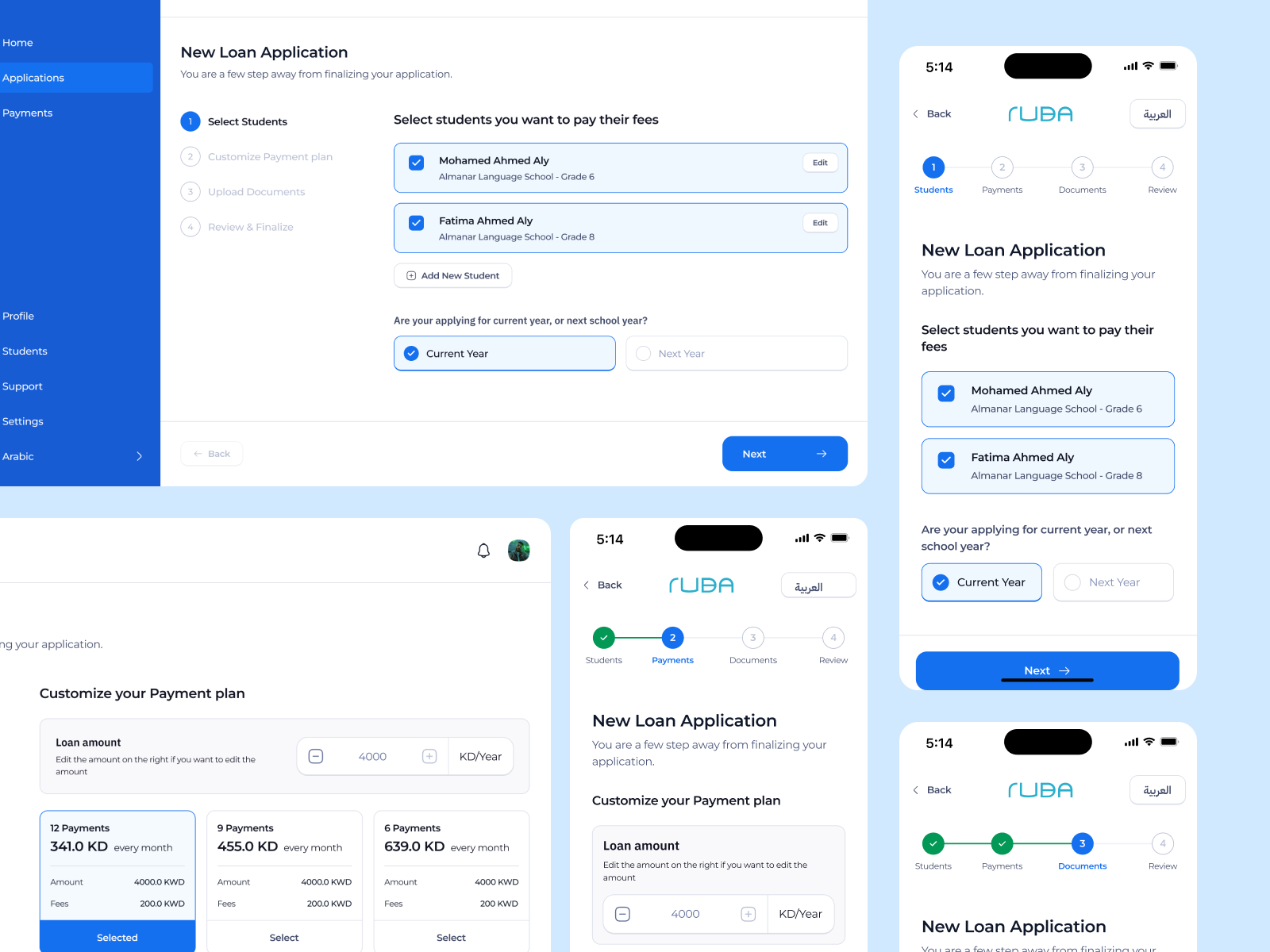
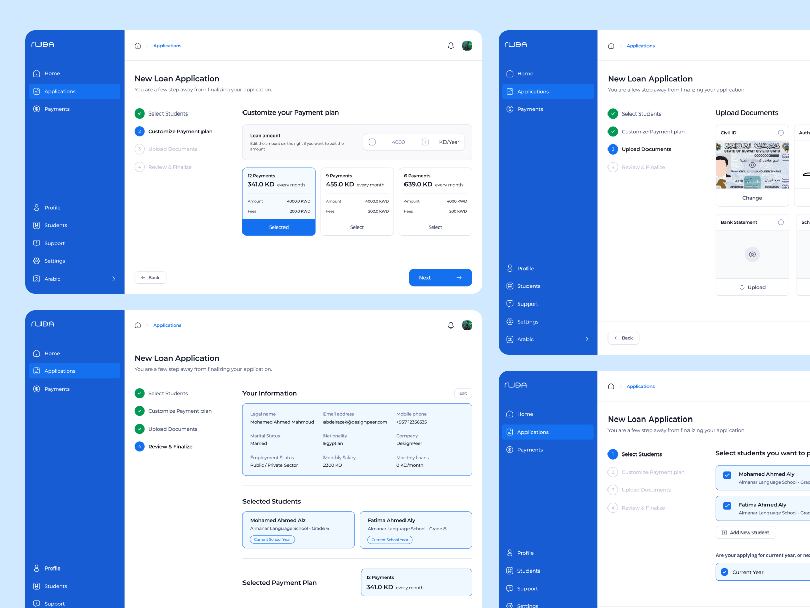
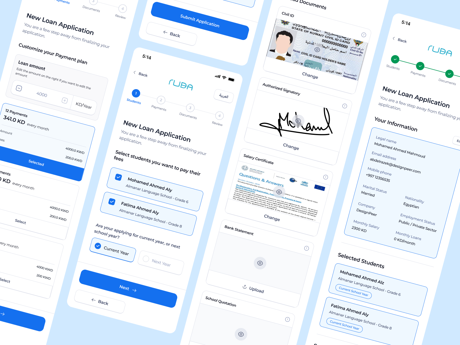
Application Flow
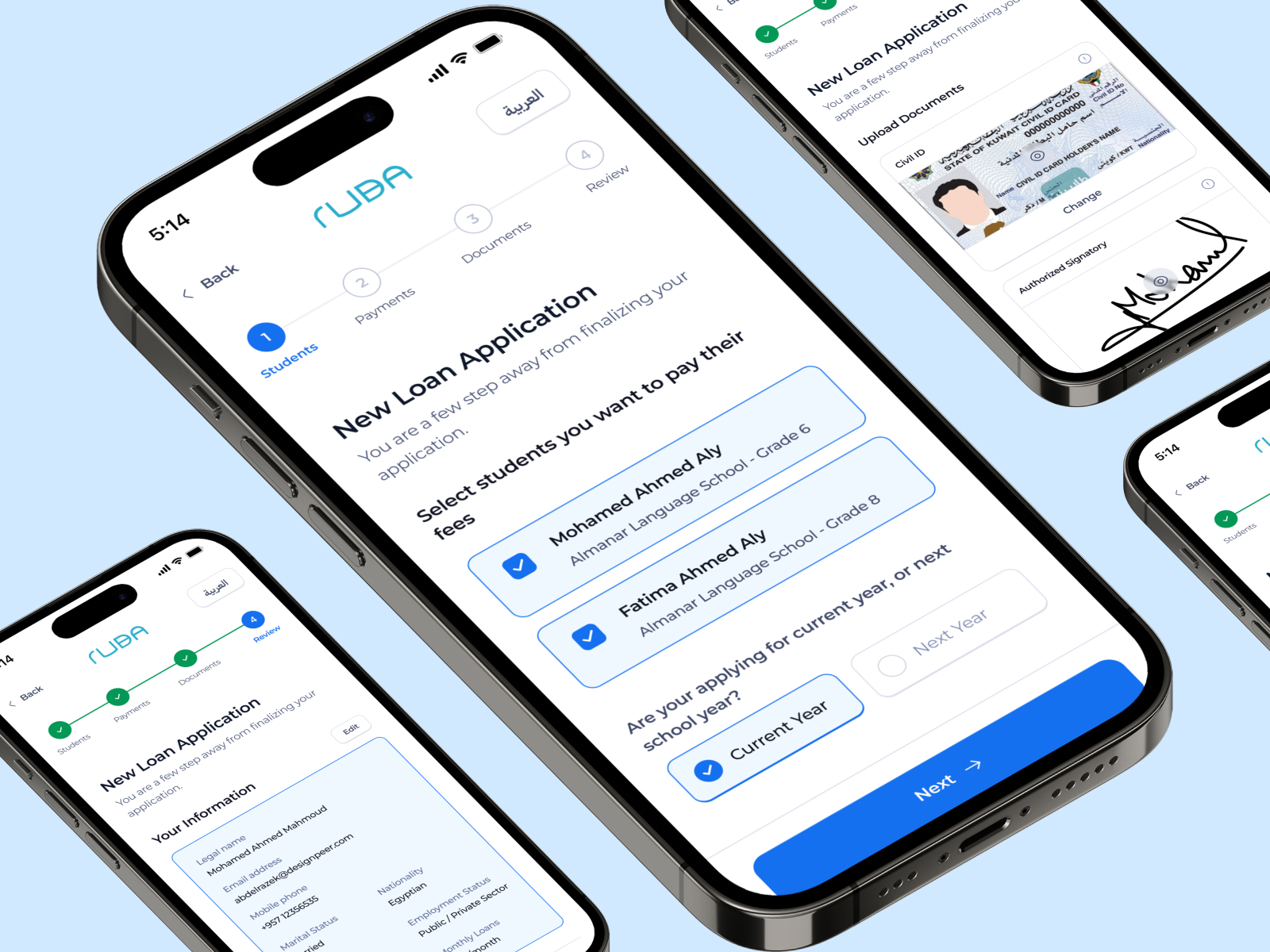
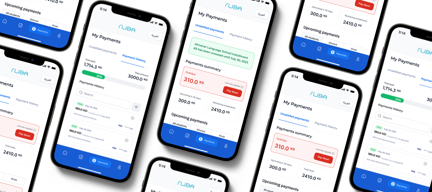
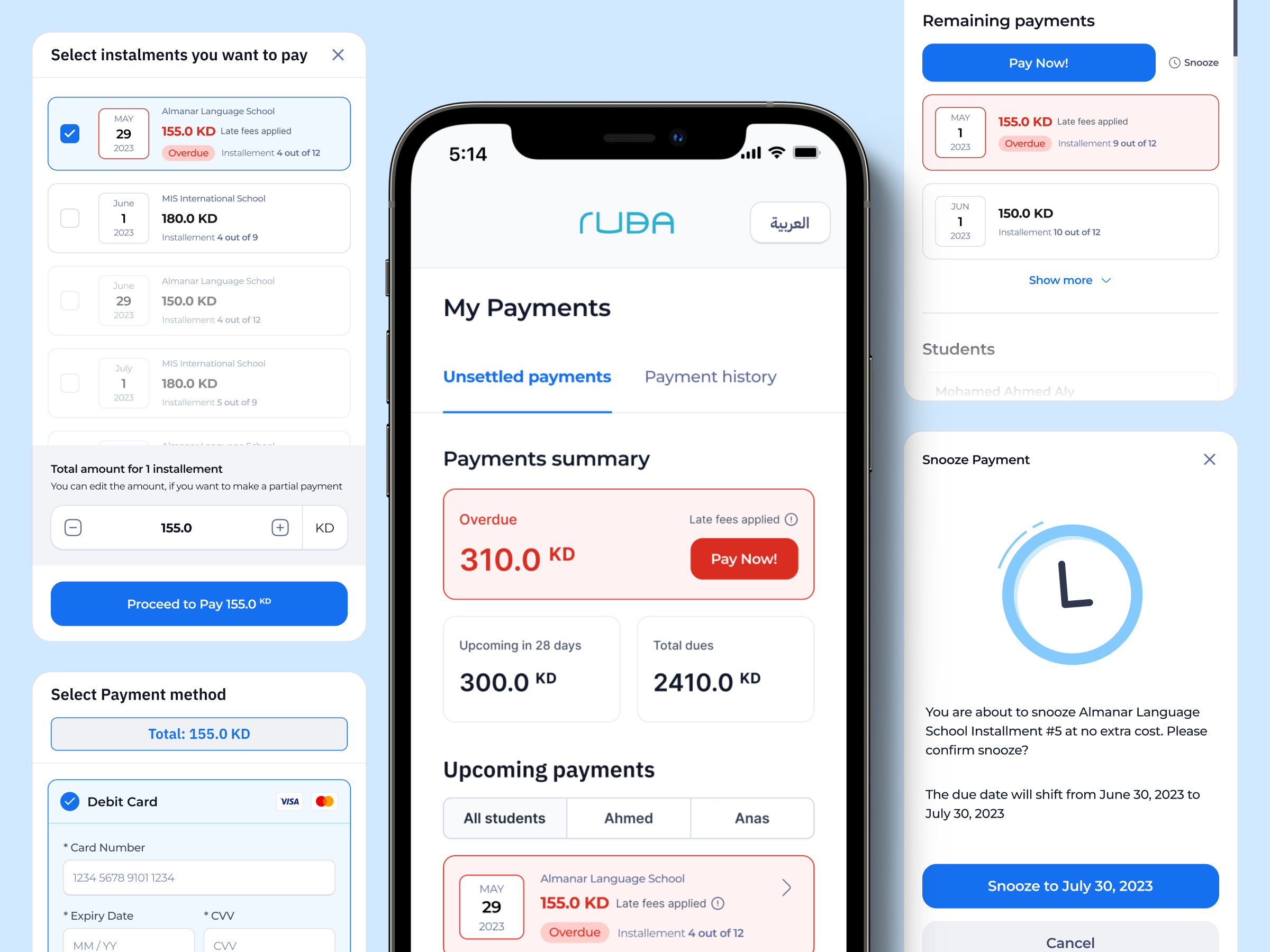
Payment Flow
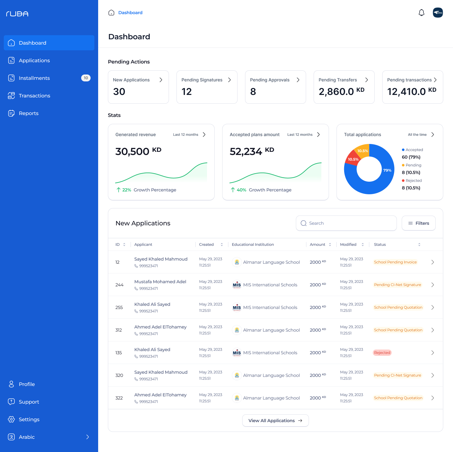
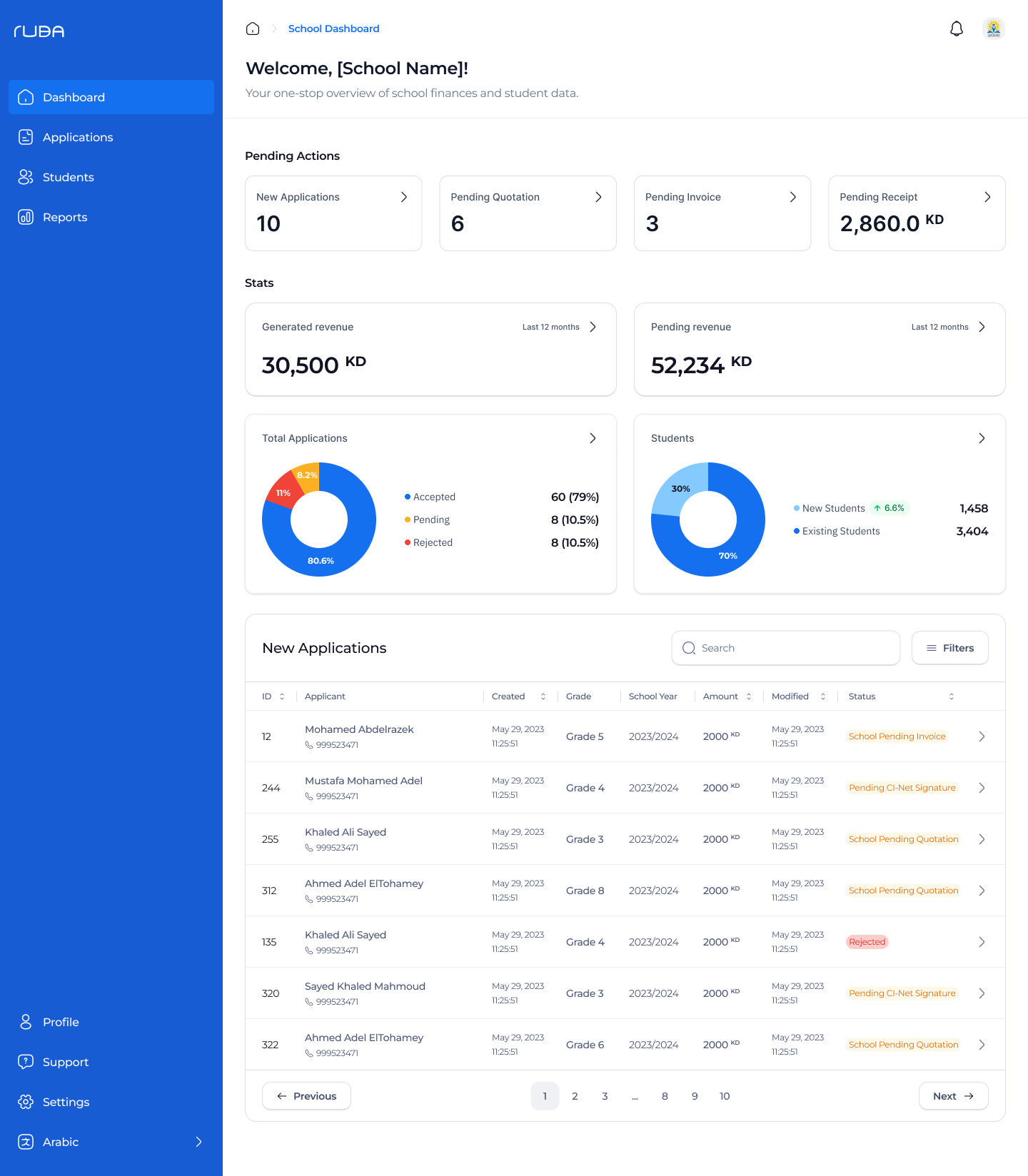
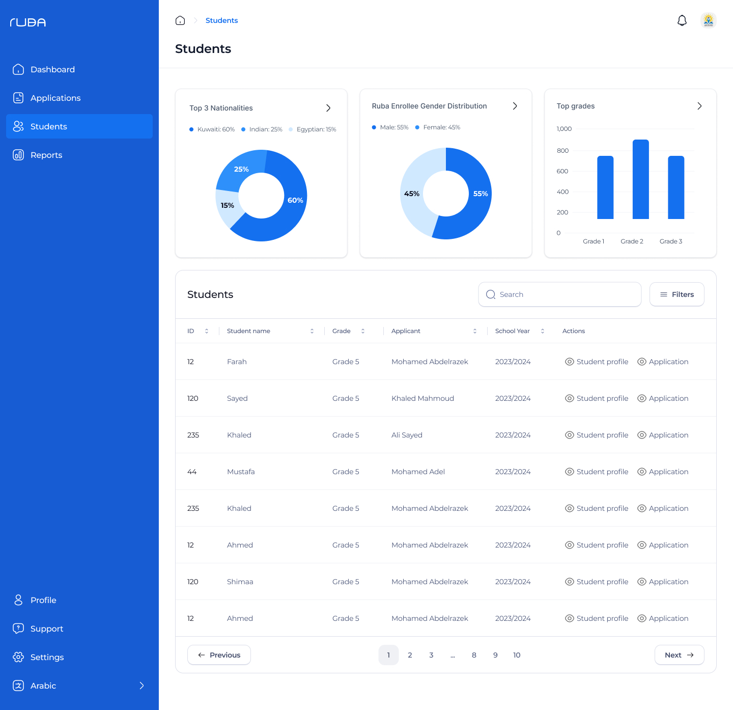
School Dashboard
Financial Institution (FI) Dashboard
