🫶 Understanding the User
The Challenge
Bekare faced significant challenges in both patient and provider experiences. The onboarding and appointment booking processes were cumbersome, leading to frustration and drop-offs. Providers struggled with managing their schedules efficiently, and the app’s overall design lacked the calming, supportive environment that mental health platforms should provide. Improving these areas was crucial to boost engagement, user satisfaction, and retention.
The Discovery
Through user research and competitive audits, we uncovered critical pain points in Bekare’s existing structure. The survey revealed inefficiencies in booking and schedule management, while users highlighted the need for a more intuitive and visually calming interface. These insights guided our redesign approach, which focused on simplifying workflows and enhancing the platform’s overall experience.
Competitive Audit
We conducted a comprehensive competitive audit, analyzing both direct and indirect competitors, including local and international platforms. Our analysis focused on key areas such as onboarding, appointment booking, and schedule management. In addition to scanning many competitors, we reviewed governmental reports from the National Center For Mental Health Promotion in Saudi Arabia, which offered insights into common concerns and frequently asked questions.
Supported by industry reports from McKinsey and other sources, our research provided a foundation for strategic improvements in Bekare. Additionally, I applied key principles from my Medium article on competitive audits, ensuring our approach was thorough and effective.
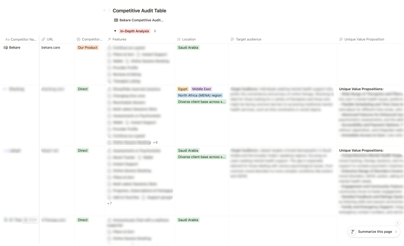 Comprehensive competitive audit: Analyzing key features, user experience, and market
positioning of direct and indirect competitors to guide strategic improvements for
Bekare.
Survey
We conducted a focused survey to understand users’ experiences, especially regarding their mental healthcare appointment booking process. The questions covered various topics, including challenges faced when booking appointments, frustrations with existing systems, and features users would prefer in an ideal mobile app. While the survey responses provided some valuable insights, they served as supplementary data, helping validate certain assumptions about user expectations. For a closer look at the questions that guided our design approach, you can view the survey link below.
Feature Prioritizationh
To ensure Bekare’s redesign addressed the most impactful improvements, we conducted a feature prioritization activity, evaluating each feature based on its desirability, feasibility, and viability. By scoring features using these criteria, we were able to determine which functionalities would deliver the highest value to both patients and providers.
Informed by my Medium article , which explains how to effectively conduct both Kano Model and feature prioritization activities, this approach helped us strategically prioritize the most critical updates for Bekare’s revamp.
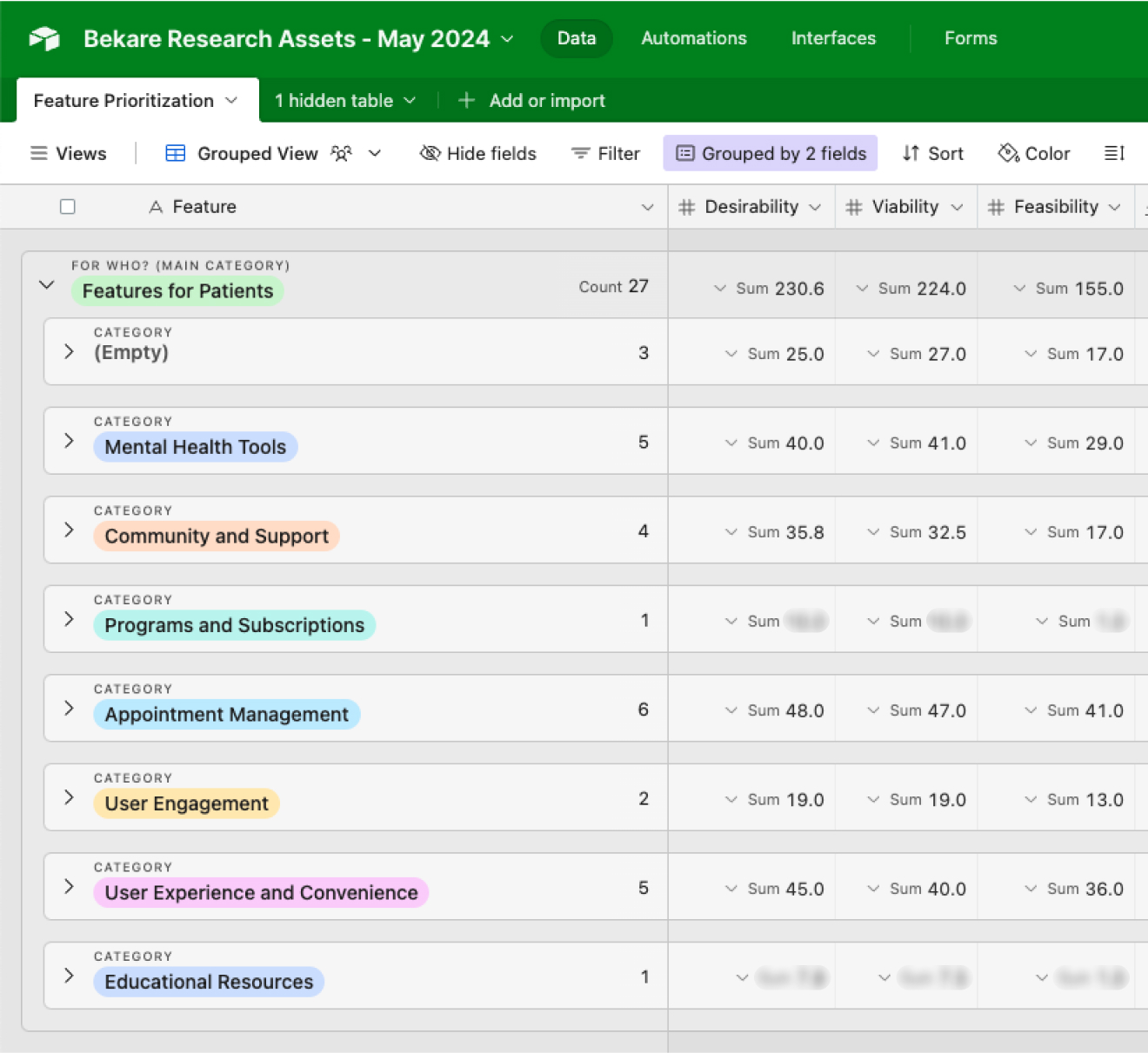 Feature prioritization: Evaluating and scoring features based on desirability, feasibility,
and viability to guide strategic decisions for Bekare’s redesign.
📱 Design
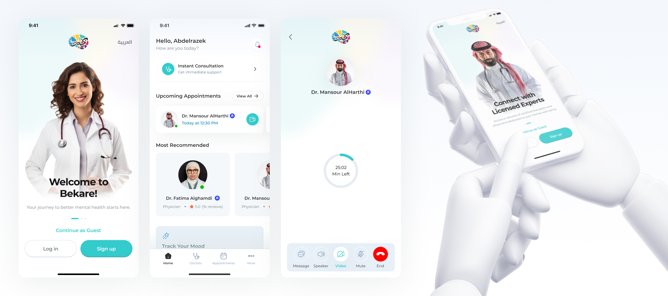
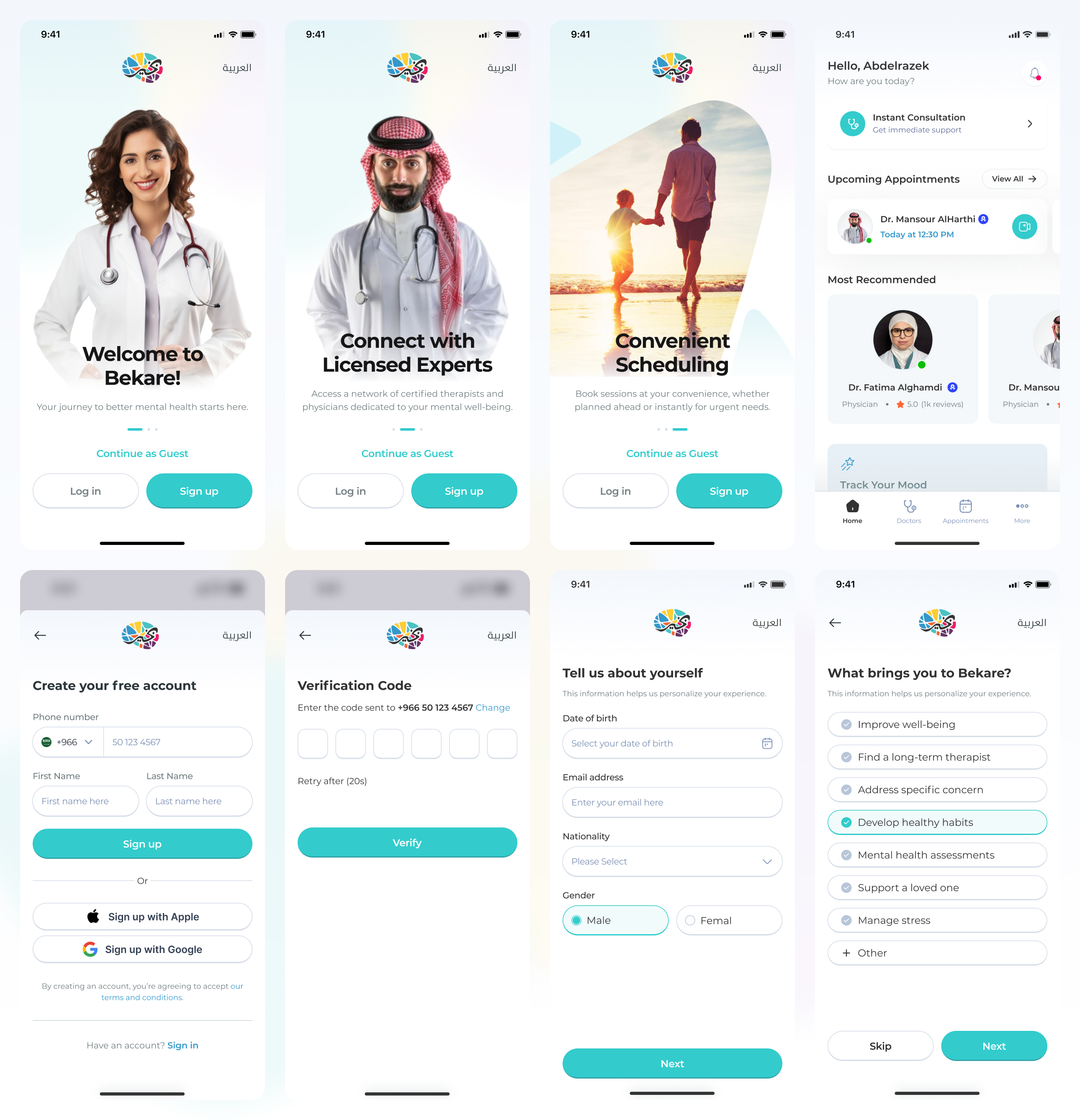
Patient Onboarding and Signup Experience
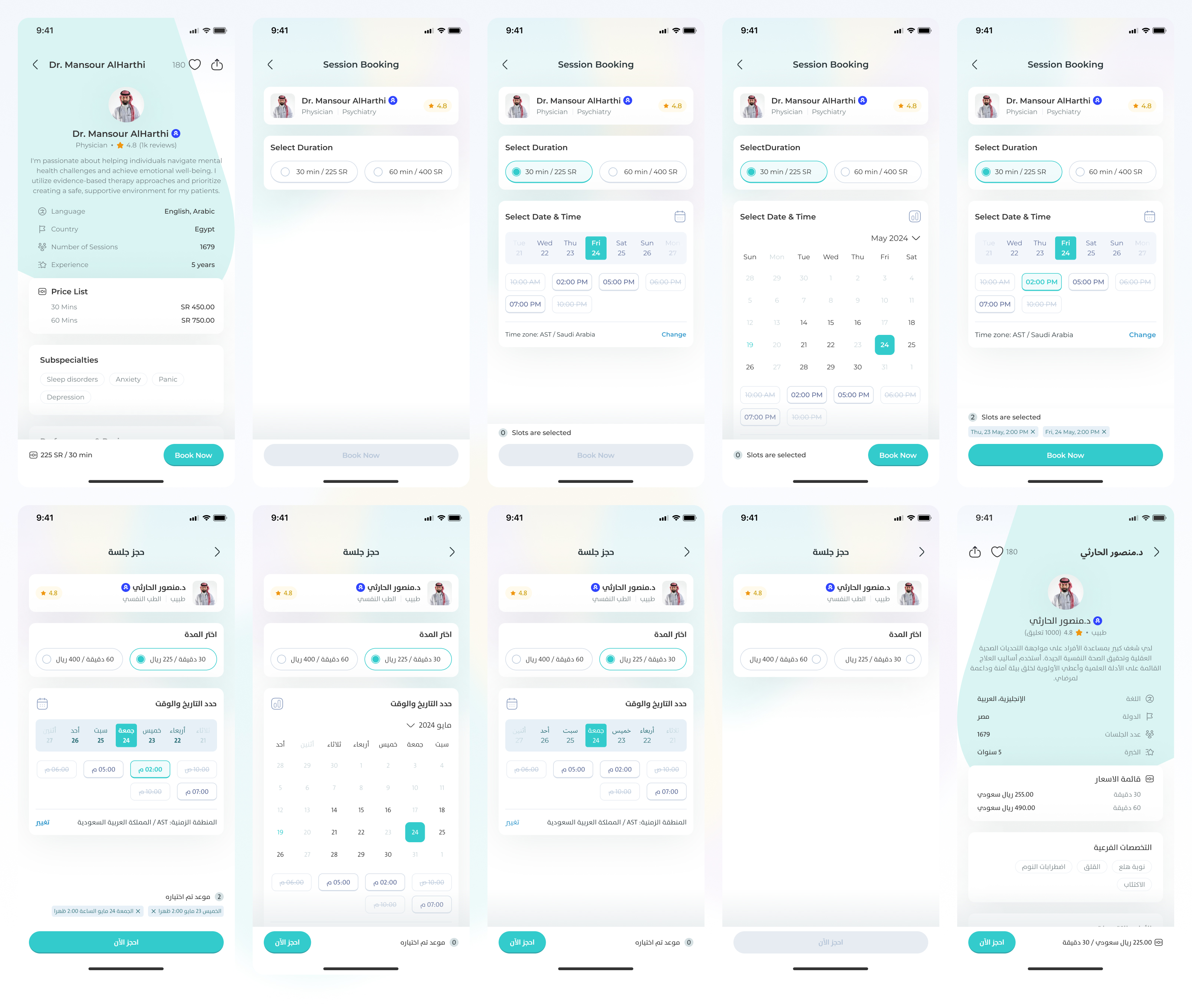
Patient Booking Flow (English & Arabic)
Patient Mood Tracker and Assessments
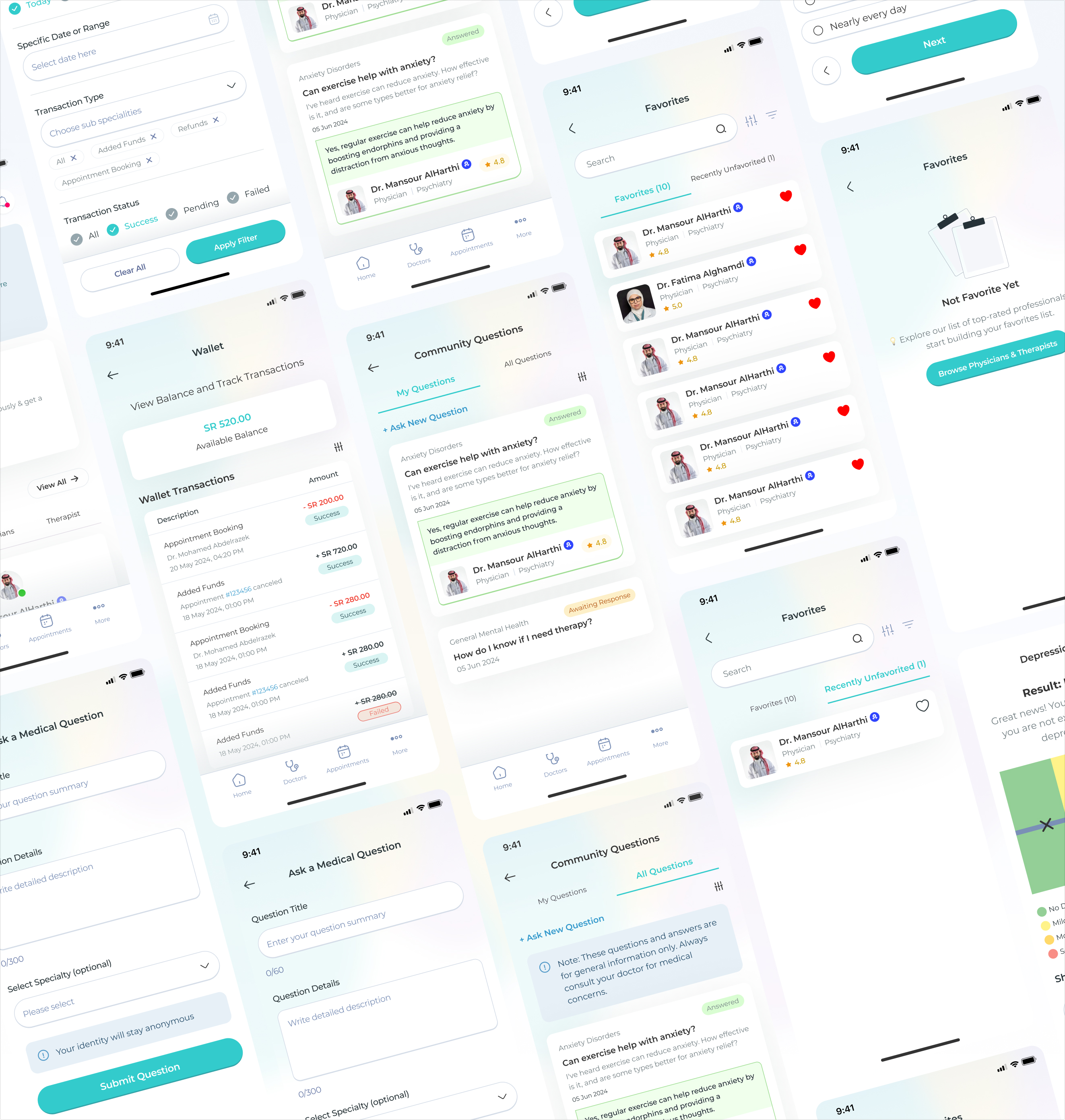
Patient Wallet, Community Questions & Favorites
